The Radiobutton is a standard Tkinter widget used to implement one-of-many selections. Radiobuttons can contain text or images, and you can associate a Python function or method with each button. When the button is pressed, Tkinter automatically calls that function or method.
The button can only display text in a single font, but the text may span more than one line. In addition, one of the characters can be underlined, for example to mark a keyboard shortcut. By default, the Tab key can be used to move to a button widget.
Each group of Radiobutton widgets should be associated with single variable. Each button then represents a single value for that variable.
When to use the Radiobutton Widget
The radiobutton widget is used to implement one-of-many selections. It’s almost always used in groups, where all group members use the same variable.
Patterns
The Radiobutton widget is very similar to the check button. To get a proper radio behavior, make sure to have all buttons in a group point to the same variable, and use the value option to specify what value each button represents:
from tkinter import *

master = Tk()

v = IntVar()

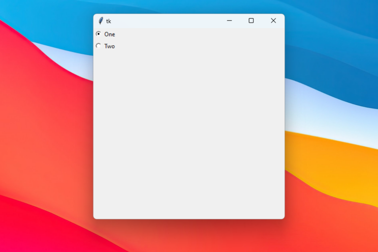
Radiobutton(master, text="One", variable=v, value=1).pack(anchor=W)
Radiobutton(master, text="Two", variable=v, value=2).pack(anchor=W)

mainloop()
Output:

If you need to get notified when the value changes, attach a command callback to each button.
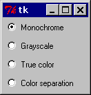
To create a large number of buttons, use a loop:
MODES = [
        ("Monochrome", "1"),
        ("Grayscale", "L"),
        ("True color", "RGB"),
        ("Color separation", "CMYK"),
    ]

    v = StringVar()
    v.set("L") # initialize

    for text, mode in MODES:
        b = Radiobutton(master, text=text,
                        variable=v, value=mode)
        b.pack(anchor=W)
Figure: Standard radio button

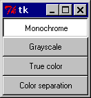
To turn the above example into a “button box” rather than a set of radio buttons, set the indicatoron option to 0. In this case, there’s no separate radio button indicator, and the selected button is drawn as SUNKEN instead of RAISED:
Figure: Using indicatoron=0

Reference
Radiobutton(master=None, **options) (class)
A radio button. Radio buttons are usually used in groups, where all buttons in the group share a common variable.
__init__(master=None, **options)
Create a radiobutton widget.
master
Parent widget.
**options
Widget options.
See the description of the config method for a list of available options.
config(**options)
config(**options)
Modifies one or more widget options. If no options are given, the method returns a dictionary containing all current option values.
**options
Widget options.
activebackground= What background color to use when the button is active. The default is system specific. (the option database name is activeBackground, the class is Foreground).
activeforeground=What foreground color to use when the button is active. The default is system specific. (activeForeground/Background)
anchor=Controls where in the button the text (or image) should be located. Use one of N, NE, E, SE, S, SW, W, NW, or CENTER. Default is CENTER. (anchor/Anchor)
background=The background color. The default is system specific. (background/Background).
bitmap=The bitmap to display in the widget. If the image option is given, this option is ignored. (bitmap/Bitmap)
borderwidth=The width of the button border. The default is platform specific, but is usually 1 or 2 pixels. (borderWidth/BorderWidth)
command=A function or method that is called when the button is pressed. The callback can be a function, bound method, or any other callable Python object. (command/Command)
compound=Controls how to combine text and image in the button. By default, if an image or bitmap is given, it is drawn instead of the text. If this option is set to CENTER, the text is drawn on top of the image. If this option is set to one of BOTTOM, LEFT, RIGHT, or TOP, the image is drawn besides the text (use BOTTOM to draw the image under the text, etc.). Default is NONE. (compound/Compound).
cursor=The cursor to show when the mouse is moved over the button. (cursor/Cursor).
disabledforeground=The color to use when the button is disabled. The background is shown in the background color. The default is system specific. (disabled Foreground/DisabledForeground)
font=The font to use in the button. The button can only contain text in a single font. The default is system specific. (font/Font).